This article is a redacted version of a post that originally appeared on the Altexsoft blog. It is republished here with permission.
Travel customer expectations have changed significantly over the last several years. As with other consumer-focused industries, near universal smartphone and tablet adoption has affected airline, OTA, and hospitality players. Mobile has become an important part of travel eCommerce. Today’s travelers, especially millennials, are constantly connected and expect as smooth experience on their mobile devices.
To meet current consumers expectations, travel providers, strive to achieve end-to-end service coverage, including mobile flight booking, mobile hotel check-in, in-destination booking, and customer support.
According to eMarketer research, digital travel sales (including airline, car rental, cruise, hotel accommodations, and transportation) reached $189.62 billion in the US in 2017, 40% of which came from mobile devices. It is 16.7% higher than the previous year. By 2021 it is expected mobile sales will represent nearly half of all digital travel sales.
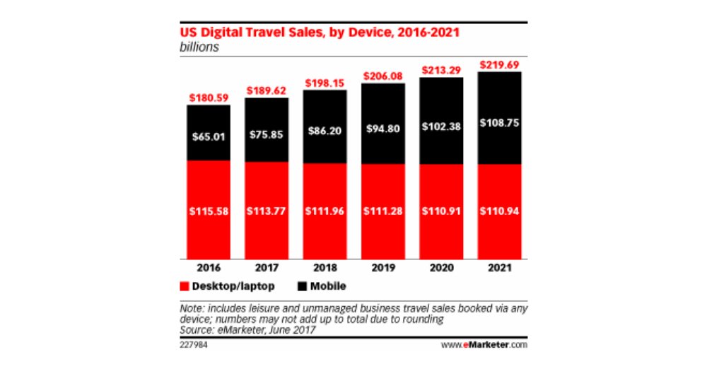 Millennials are more inclined than older generation to book their trips on mobile. 57.5 million of US adults used a smartphone to book a trip in 2017, which is a 14.1% growth over the previous year.
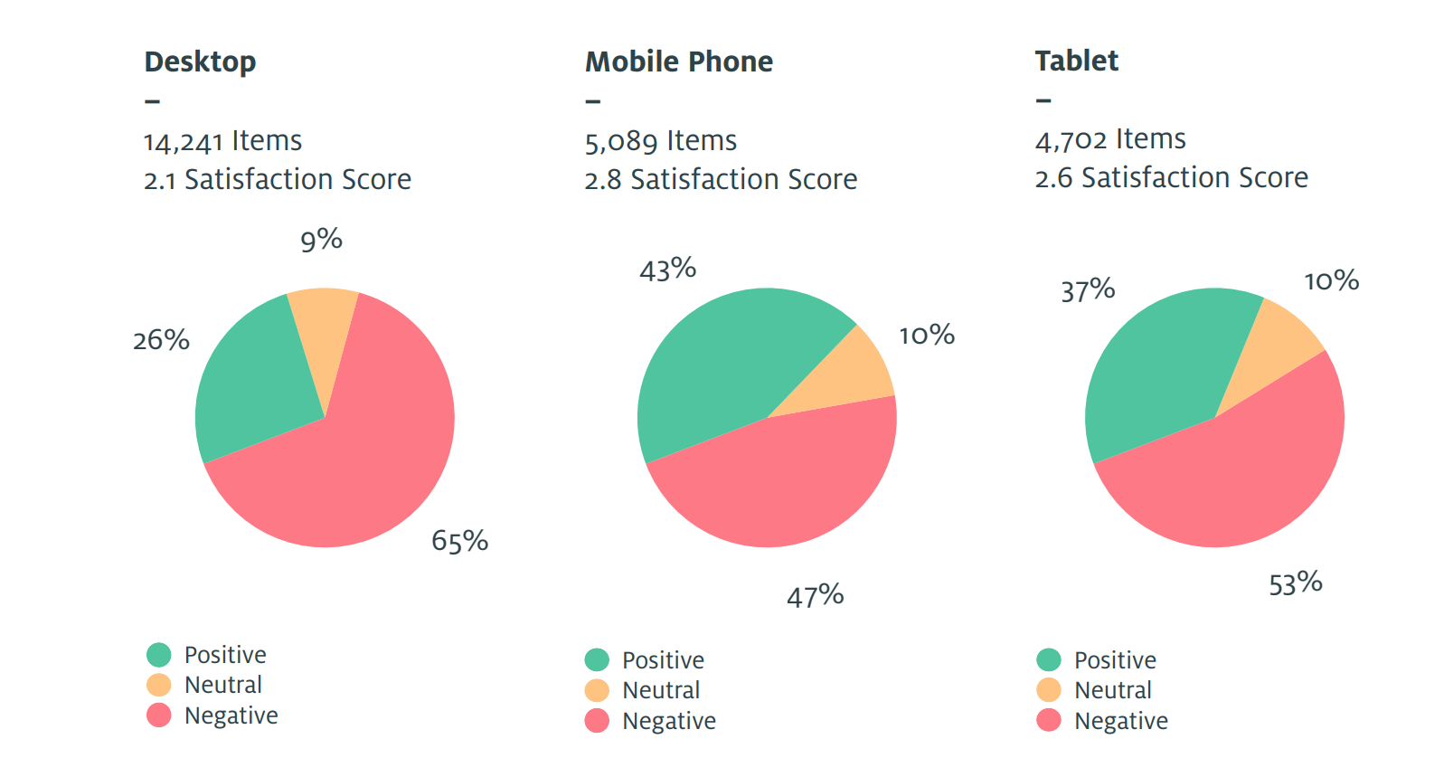
Travel remains an area where both mobile and desktop bookings are the pain points of user experience. Let’s have a look at airlines for example. According to the Usabilla Aviation User Feedback Trends Report, desktop versions of airline websites have generated the largest volume of the negative feedback.
While mobile websites have received a higher percentage of positive feedback than the tablet and desktop, they only attained a satisfaction score of 2.8 out of 5. While airlines are working hard to improve their mobile user experience, the overall perception of the process is still unsatisfactory.
We’ve already covered UX problems of airlines, mostly those that relate to desktop experience. This time we’ll focus on travel applications and present a few approaches that help airlines and hospitality industry players meet travelers’ needs in the mobile booking experience.
1. Straightforward calls-to-action on the app main screens
Customer experience begins the moment a user runs an app. When opening your mobile app, the traveler has a very specific purpose in mind and expects to complete their actions with minimal effort. Unlike many everyday apps that are designed for joy or recreation, such as games or social media, travel booking applications must ensure the shortest path from launch to goal completion.
To pave the way for users achieve their goals, your app must provide simple, straightforward navigation, helping the person move forward at every step of the way.
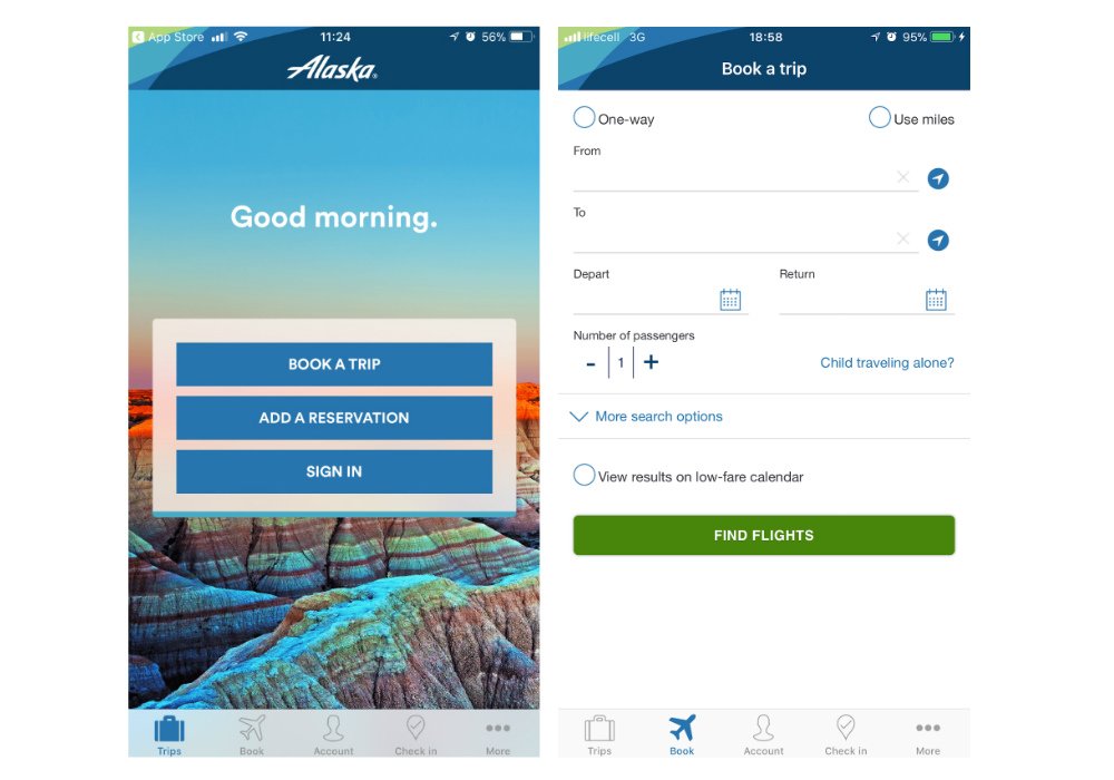
The Alaska Airlines app homepage is a perfect example of an effective navigation menu with three primary call-to-action options. Such a simplified approach immediately communicates users the actions they can take and connects them with the main app functions.
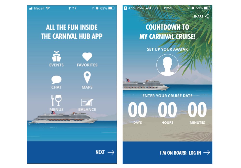
Carnival Hub, a booking app for cruise passengers, also divides its main functions into six categories that steer users to key options of the app.
2. Flexible, personalised, and effective search engine
The simple truth is, if users can’t find the flights or hotels they want, they won’t be able to book. It’s crucial to have precise, flexible, and clear search options in the app. Let’s have a look at the best practices for making the search an efficient:
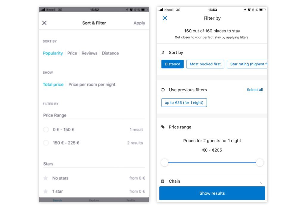
Flexible search filters: Add search filters that can narrow the results according to search criteria essential for users. Skyscanner and Booking.com are good examples of flexible search filters that allow users to sort results depending on the most important factors such as price range, star rating, popularity, and review score.
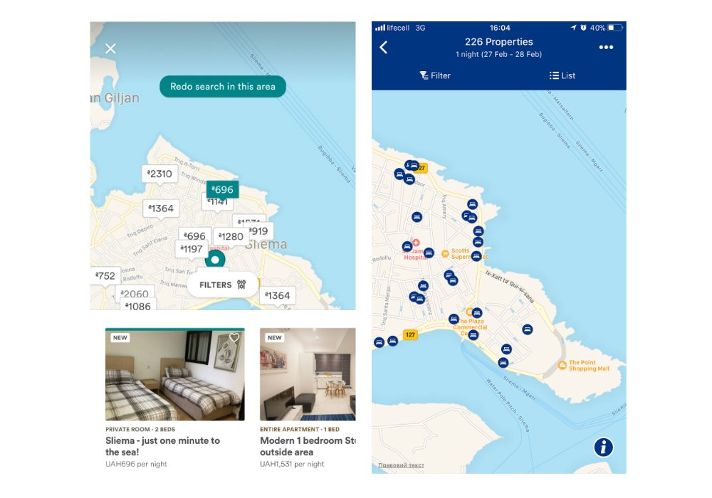
Visibility and accessibility: The search options must be clearly visible and easy to access. Compare Airbnb and Booking.com features for searching accommodation on the map. Airbnb provides price visibility on the map so you can simultaneously choose the location and assess your budget, while Booking.com requires you to click on the icon of each hotel to find out the cost of the accommodation.
Personalised suggestions: Make sure your product provides personalised suggestions based on previous user searches and booking history. If the user has already visited the location in the past, it’s a good idea to suggest trying new experiences, the ones they haven’t considered during previous visits.
Content prioritisation: While designing a search results page, keep your business priorities in mind and align them with the way you display content. Let’s compare Booking.com and Skyscanner search results.
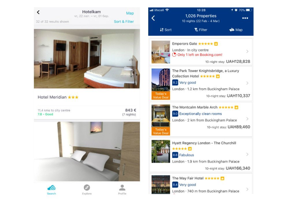
Booking.com presents more items in a single screen with smaller property images while Skyscanner offers large photos with only the most basic info. Such difference in search results is driven by the business goals of these two services. Skyscanner is a metasearch engine that connects users with hotels, OTAs, or airline websites.
Its main goal is to inspire and attract users to visit the provider’s site. Booking.com is a direct reseller and its main goal is to push users to book the stay immediately, with the resulting need to present as many informative offers as possible.
3. Simple and transparent payment process
Smartphone displays grow larger and mobile payment forms get simpler. Nevertheless, an error at any stage of the payment process can scare users off and push them towards booking on the desktop or a different platform altogether. If you want to prevent your users from switching to a different app make sure your processes are clear and unambiguous.
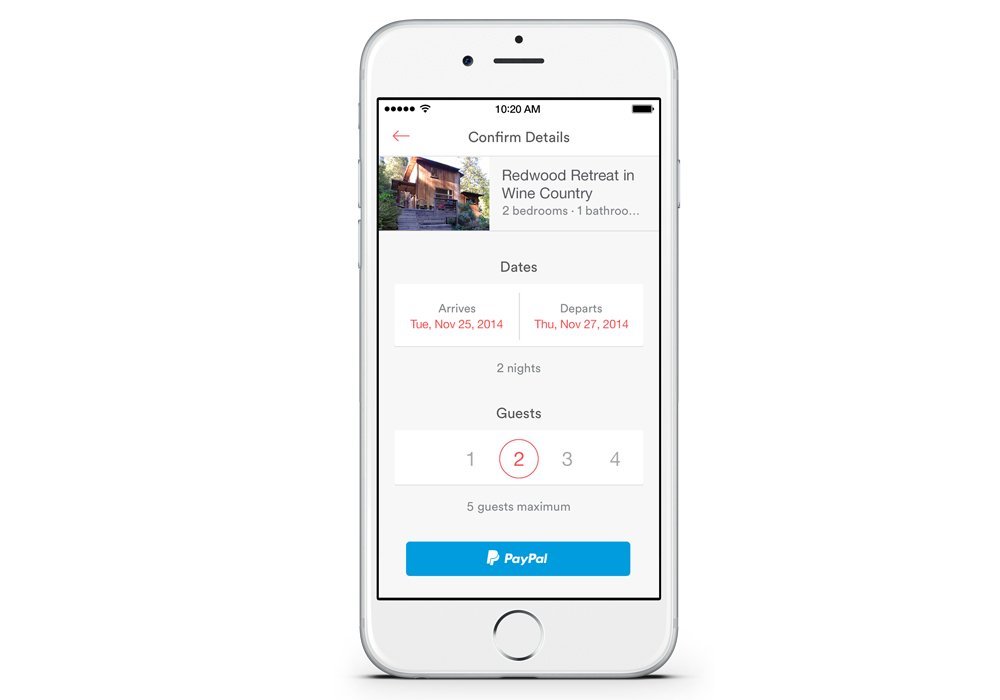
Multiple payment options: Provide multiple payment options for customer’ convenience. Besides the support of traditional card issuers, including Visa, MasterCard and American Express, ensure integration with PayPal, Apple Pay, and Android Pay as these services drastically simplify mobile payments, while providing the necessary level of security.
Credit card scanning: Typing credit card details into small mobile fields is far from being an entertaining and simple task. Credit card scanning using a mobile camera drastically streamlines this procedure.
Clear price: Avoid hidden fees that a user will only unveil right before the purchase. The price on the search result screen shouldn’t differ from the price and on the purchase screen. All prices must match those advertised elsewhere in the app.
Currency converter: Allow users to switch a currency at any time and check prices in a convenient way.
4. Inspirational visual content
Quite often travelers don’t have a set destination in mind and they are browsing around in search of inspiration. 60% of them research their next trip from mobile devices. Since the phone screen of the phone is much smaller that the desktop monitor, it becomes difficult to maintain a visual experience of the explored destination. The app should provide a fair amount of visuals to grab travelers’ attention and help them make a choice.
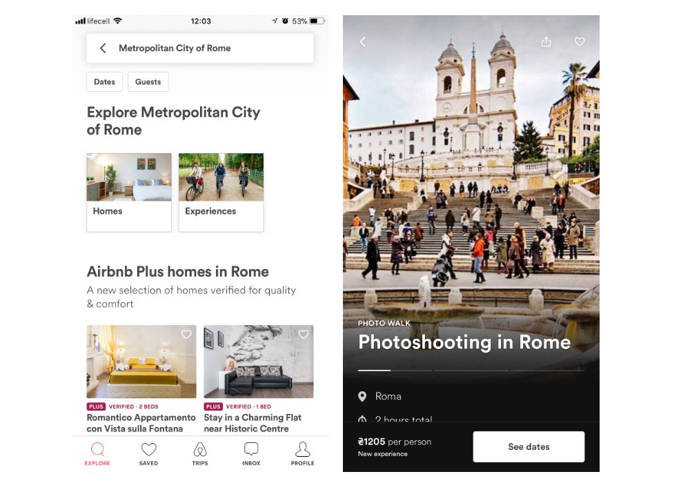
An excellent example of an app that inspires people to travel is Airbnb. It provides full-screen stories mode for images to leverage all space available and overlay info text rather than having separate sections for it.
5. Informative push notifications
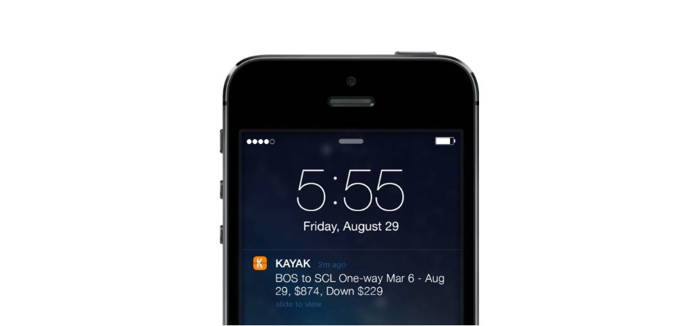
Push notifications enable personalised customer experience on mobile, offering valuable information to users. For travel apps, push notifications should be based on a user’s travel history, in-app behavior, location, and browsing habits.
Let’s have a look at the main types of using push notifications that are worth considering for a travel app:
- Check-in reminders: Help travelers check-in on their flight on time.
- Location-based navigational notifications: Help users find their way in the airport between terminals or guide them to their stay location.
- Suggestions for nearby places and activities: In-app messages that suggest nearby places to rent a car, eat, or party.
- Assistance with luggage: Push notifications with information about where travelers can pick up their baggage on arrival at the destination.
- Contextual experience: Suggesting things to do and interesting deals around the city based on user location data and personal history.
- Weather and disruption information: Extreme changes of weather can cause mass flight and other travel disruptions. Make sure to warn users about such events in advance.
It’s important to prevent customer annoyance with too many mobile messages. The best approach is to make focused and relevant notifications that are significant in the individual user’s context. To improve customer experience even more you can mix up reminders and “nice-to-know” messages, as well as update the quality and quantity of the messages based on the user’s reaction to the notifications.
6. Mobile boarding passes in airline apps
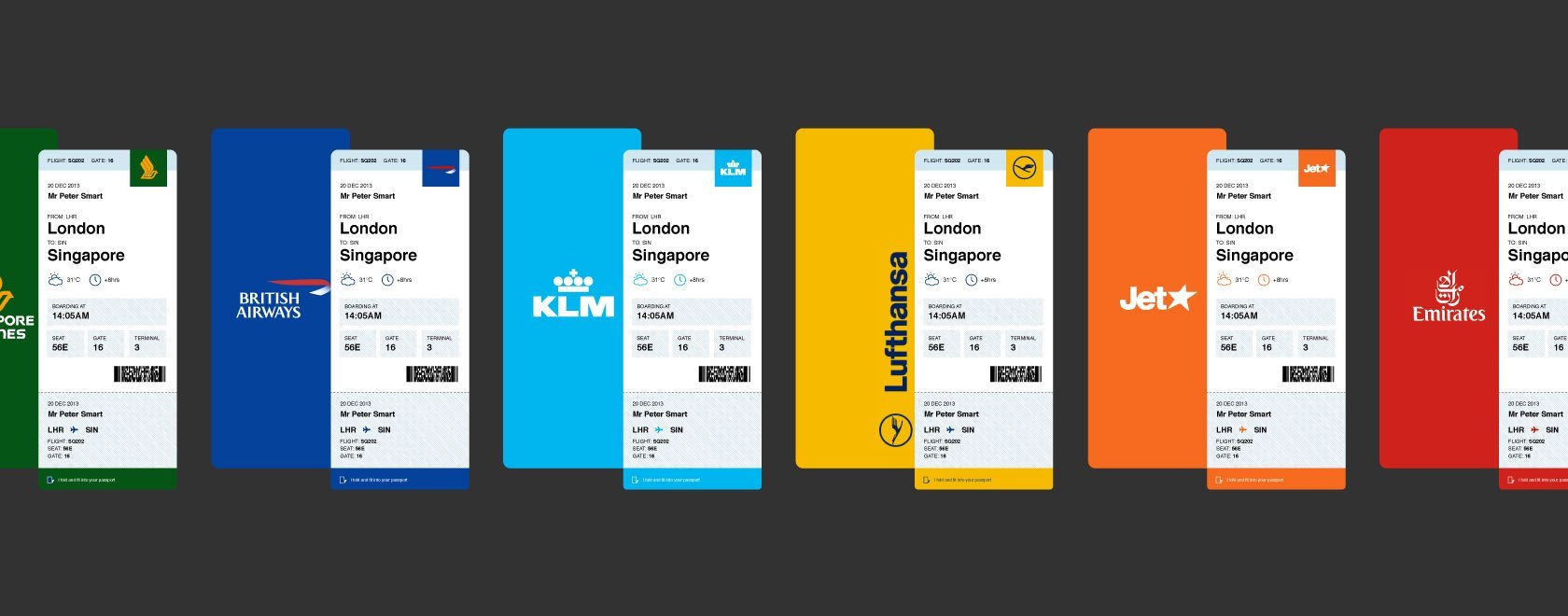
According to the study by Juniper Research, one out of three boarding passes will be delivered via mobile by 2019. A mobile boarding pass allows travelers to save time printing out paper versions and waiting in the check-in line. All the user needs to do is check in online and download a boarding pass on the mobile device.
The ideal way of promoting the use of mobile boarding passes is integrating them with a mobile wallet. The digital wallet is an app commonly installed on mobile devices by default. Catering to users that have mobile wallets is a smart move that only requires saving boarding passes in matching formats. Using digital boarding passes will provide better customer experience as they can be stored in one place and stay visible on a lock screen until the customer gets on the flight.
So, it’s always ready and a traveler doesn’t need to search for it in mobile emails. The most popular wallets are Apple Wallet on iPhones, Android Pay on Android, and Samsung Pay on Samsung.
7. Secure checkout process
About 50% of travelers do their research on mobile but move to the desktop to complete the booking.
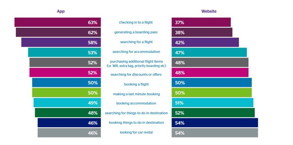
The main reason for this is the perceived lack of security in completing payments on mobile devices. To make your customers feel protected during the in-app booking process:
- Provide integration with a mobile wallet to make payments using stored credit cards.
- Support security features that are in the devices, like fingerprint readers.
- Incorporate time-outs, complex password requests, and two-factor authentication.
- Provide step-by-step navigation and eliminate errors with card scanning via camera.
Final recommendations
Creating and designing apps with the user in mind is an essential part of the travel industry. Here’s the list of our final recommendations to follow:
Always test your decisions
Test the visual content, the way the search results are presented, sorting and filtering, or any other parameter that may affect the conversion. Use a subset of users first. When you see a noticeable change in outcome, – roll out updates for all users with the greater confidence.
Prioritise the most popular pages
Focus improvements on the areas and pages of your application, receiving the most users attention. Chances are – these updates will provide the largest positive effect you can achieve.
Implement all security payment methods
To make travelers feel safe when booking flights or hotels, ensure that you provide all security measures possible. Start with ascertaining that you have payment time-outs, require complex passwords, and two-factor authentication. Other important options to consider are mobile wallet integration as well as the support of mobile payment methods, Apple Pay and Android Pay.
For such advanced approaches as credit card scanning, we recommend engaging an external security consultant to advise you on additional measures to be taken.
Collect feedback
Incorporate explicit feedback functionality on your app to collect detailed information from users that want to share their ideas. This is a fantastic source of information about the greatest customer struggles and most valuable new features for your solution.
Provide useful push notifications
Updating trip status, flagging flight price changes, suggesting discounts and offers, and posting reminders about booking in progress may come close to creating travel bliss.


 share
share


